Sunflower Drawing Through Art, Printing
Graduation Cap Drawing: A Practical Guide for Artists and Print Projects
Arslan Khokhar
September 17, 2026
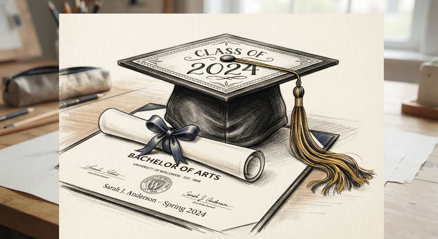
A graduation cap drawing represents achievement, education, and a new stage of life. The image appears on graduation cards, school posters, invitations, stickers, apparel, classroom materials, and social media graphics. Its recognizable square top and hanging tassel make it suitable for both simple sketches and detailed illustrations.
Artists can approach this subject in many ways. A child may draw a cheerful cartoon cap, a student might create an image for an assignment, and an illustrator can develop polished artwork for commercial printing. A strong result begins with understanding the cap’s construction, then choosing materials and methods that match the intended use.
Understanding the Graduation Cap Structure
The formal name for a graduation cap is a mortarboard. Its upper section looks like a flat square viewed in perspective. Beneath that square sits a fitted fabric cap. A small button at the center holds the cord and tassel.
Perspective gives the mortarboard its convincing shape. The upper square usually appears as a diamond or a flattened four sided form. The front and rear edges should relate to the same viewing angle. The fabric base can be drawn with curved sides that wrap around the head.
The tassel includes a cord, knot, and bundle of threads. It should hang naturally from the center button, cross one part of the board, then drop over an edge. Gravity pulls the lower threads downward, so avoid drawing them as stiff horizontal lines.
Drawing Supplies and Art Materials
A basic graphite pencil and plain paper are enough for practice. More developed artwork may require several tools.
- Graphite pencils, such as HB for construction lines, 2B for shading, and 4B for dark folds
- A soft eraser for corrections and a kneaded eraser for lifting graphite
- Charcoal for deep shadows and expressive studies
- Ink pens or fineliners for permanent line art
- Colored pencils, markers, watercolor, or acrylic paint for color
- Smooth cardstock for ink and marker work
- Watercolor paper for wet media
- A ruler for checking angles, used lightly so the drawing does not look mechanical
- A drawing tablet with Adobe Photoshop, Adobe Illustrator, Procreate, or Canva for digital work
Paper texture changes the result. Smooth paper supports clean pen lines and small lettering. Medium texture holds graphite and colored pencils nicely. Heavy watercolor paper handles washes with less buckling. Canvas suits acrylic paint, yet its woven surface can make tiny details difficult.
How to Draw a Graduation Cap Step by Step
Start with light pencil marks that can be erased easily. Avoid pressing hard during the construction stage.
- Draw a shallow diamond. This becomes the mortarboard’s top surface. Check that opposite edges follow compatible angles.
- Mark the center of the diamond. Add a small circular button at that point.
- Draw the fabric cap beneath the board. Use two short side curves and a wider curved lower edge to suggest a form wrapping around a head.
- Add the cord from the button to one edge. Let it bend slightly rather than forming a rigid line.
- Extend the cord downward. Draw a small knot near its end.
- Build the tassel with several long, narrow thread groups. Vary the outer contour a little so it feels soft.
- Refine the outline. Correct uneven corners, awkward overlaps, and misplaced curves.
- Erase construction marks, then add shading, ink, or color.
For a front view, keep the board nearly symmetrical. For a three quarter view, make the nearer edges appear a little larger. The cap base should sit below the board, not inside its top surface. This relationship is one detail that beginner often misses.
Sketching, Line Art, and Shading
Pencil sketching works best with light directional strokes. Use the side of a graphite pencil for broad shadows and the point for seams or tassel threads. A kneaded eraser can lift thin highlights from dark graphite. Charcoal creates richer blacks, though loose dust needs fixative before storage or scanning.
For ink line art, vary line weight. Use a heavier contour under the mortarboard and near overlapping forms. Apply thinner lines on the upper surface, cord, and internal fabric folds. This variation gives depth without requiring much shading. Let ink dry fully before removing pencil marks.
Choose one light source for realistic shading. A cap lit from the upper left will have darker values beneath the board, inside fabric folds, and along the tassel’s right side. Add a narrow highlight to a satin cord or button. Pure black can flatten the picture, so reserve the darkest value for small areas.
Color can connect the image to a school. Colored pencils are useful for controlled layers. Markers produce broad, even areas, though testing for bleed is smart. Watercolor creates soft transparent color. Acrylic paint offers opaque coverage on paper, board, or canvas. One artist may use a school color on the cap and a contrasting gold tassel.
Style Ideas for Different Artists
A realistic graduation cap needs believable perspective, fabric folds, reflected light, and individual tassel threads. Reference photos help artists study how the cap base bends and where shadows collect.
A cartoon version may use a large tilted board, thick outlines, bright color, and a tassel with exaggerated movement. Children can add a smiling face, stars, a diploma, or confetti. Beginners can practice a simple side view before attempting dramatic perspective.
Minimalist art can reduce the cap to a few black lines or a solid silhouette. Decorative versions may include flowers, school initials, a graduation year, or short lettering on the board. Botanical accents can wrap around the cap without hiding its main shape.
Experienced artists might try an abstract arrangement made from geometric planes, painted textures, or overlapping academic symbols. Professional illustrators can create a coordinated set containing caps, diplomas, books, ribbons, and badges.
Common Mistakes and Practical Corrections
- Uneven board angles: Compare opposite sides and redraw them with matching perspective.
- A cap base that looks flat: Add curved edges and a shadow directly below the board.
- A tassel attached to the wrong spot: Begin the cord at the center button.
- Stiff tassel threads: Use gentle curves with small variations in length.
- Excessively dark construction marks: Sketch with an HB pencil and light pressure.
- Random shading: Decide where the light comes from before adding values.
- Too many tiny details: Simplify areas that will be printed at a small size.
- Muddy color: Let wet layers dry before applying the next watercolor or acrylic passage.
Correction is part of normal drawing practice. Place tracing paper over a sketch to test new angles without damaging the first version. Digital artists can use separate layers for construction, line art, color, shading, and text.
Digitizing Hand Drawn Artwork
Scan flat artwork at 300 DPI for full size printing. Use 600 DPI for delicate line art, small originals, or images that may need moderate enlargement. Save an untouched master scan before cleaning dust or adjusting levels.
If a scanner is unavailable, photograph the drawing under soft, balanced lighting. Position the camera parallel to the page. Use a tripod or firm support, fill the frame, and avoid shadows from hands or nearby objects. Correct lens distortion and white balance in Adobe Photoshop or another image editor.
Remove the paper background only when transparency is needed. Inspect edges at high magnification, but judge the final image at its intended print size too. Excessive sharpening can create halos around dark lines.
Preparing Graduation Cap Artwork for Printing
Print dimensions and resolution must be planned together. A 10 inch by 8 inch image printed at 300 DPI needs 3000 by 2400 pixels. Enlarging a small JPEG rarely creates convincing detail.
Use these production checks:
- Set raster artwork to 300 DPI at final size.
- Keep text and key artwork inside a safe margin, often at least 0.125 inch from the trim line.
- Add bleed when color reaches the paper edge. Many printers request 0.125 inch on every side.
- Ask the printer for its preferred CMYK profile and file settings.
- Review spelling, dimensions, orientation, and crop marks.
- Order a proof for projects involving many copies or sensitive school colors.
RGB uses red, green, and blue light for screens. CMYK uses cyan, magenta, yellow, and black ink for commercial printing. Some bright RGB colors cannot be reproduced exactly in CMYK. Convert a copy of the artwork using the printer’s requested profile, then check dark areas and saturated colors.
PNG supports transparency and suits digital graphics. JPEG creates smaller files for photographic artwork, though repeated saving reduces quality. PDF is widely used for print layouts and vector content. TIFF works well for high quality raster masters. SVG keeps vector graduation cap art scalable for signs, vinyl cutting, and web use.
Choosing a Printing Method and Surface
Inkjet printers work well for art paper, photo paper, stickers, and small card batches. Pigment ink usually offers better display life than many dye ink sets. Laser printers handle text, invitations, and classroom sheets efficiently, yet thick or coated stock must be approved for the machine.
Professional printing is useful for posters, greeting cards, apparel, large runs, and color controlled work. Giclée printing uses high quality inkjet equipment and archival media for art reproductions. Screen printing may suit shirts and tote bags. A print shop can produce mounted wall art, canvas, decals, and specialty invitations.
Paper weight affects handling. Cardstock provides stiffness for cards and tags. Textured paper gives pencil or watercolor reproductions a tactile appearance, but heavy texture may soften fine lines. Request a paper sample and physical proof when accurate color matter a lot.
Copyright, Sales, and Display
An original graduation cap illustration is normally protected by copyright once it is created and recorded in a fixed form. Keep dated sketches and source files. Do not copy another artist’s composition, school mascot, logo, or licensed character. Commercial use of institutional names and marks may require permission.
Artists selling downloads should state the allowed uses. A personal license, small business license, and extended commercial license can carry different terms. Provide buyers with suitable files, dimensions, color information, and clear printing notes.
Store original drawings flat in acid free folders. Keep prints away from moisture, direct sunlight, and extreme heat. Archival mats and glazing help protect framed work. Never let delicate graphite or charcoal press directly against glass. Canvas pieces can be displayed with a frame or finished edge, depending on the artwork.
Frequently Asked Questions
What pencil is best for a graduation cap sketch?
An HB pencil works well for the first structure. Use 2B or 4B for darker shading.
How can I make the mortarboard look three dimensional?
Draw it as a shallow diamond, maintain consistent perspective, and place a shadow beneath its front edge.
Which program is best for digital graduation cap art?
Procreate is friendly for tablet drawing. Adobe Photoshop suits raster painting, Adobe Illustrator suits vector art, and Canva supports simple layouts.
What resolution should printed artwork use?
Prepare raster artwork at 300 DPI at the final print dimensions. Fine line drawings may benefit from a 600 DPI master scan.
Should I submit RGB or CMYK artwork?
Use the color mode requested by the printer. Screens display RGB, and many commercial print workflows use CMYK.
Which file format is best for a transparent background?
PNG is practical for raster artwork with transparency. SVG is useful when the image is vector based and needs scaling.
Can I print a graduation cap drawing at home?
Yes. Home printing works for tests, classroom sheets, cards, and short runs. Check the printer’s supported paper weight and use the correct media setting.
How should I protect a finished print?
Use acid free storage materials, clean framing supplies, and glazing with ultraviolet protection. Display the piece away from direct sunlight and damp area
Share It
Previous Post
Recent Posts